How to Navigate your Portal Analytics

Welcome to this guide on navigating your Portal Analytics Dashboard. Whether you're new to the platform or looking to deepen your understanding, this overview will walk you through the key features across four main areas of the dashboard: Enquiries, Discovery, Portfolio, and Market.
1. Enquiries: Tracking Interest Across Your Portfolio
The Enquiries section offers valuable insights into how tenant interest is performing across your entire property portfolio.
Adjustable Date Range
At the top of the dashboard, you’ll find the Date Range selector, which allows you to display any dataset that suits your needs. In this example, the view is set to October, marking the beginning of the letting season. However, you can adjust the range to cover the full season, previous seasons, or even specific custom periods.
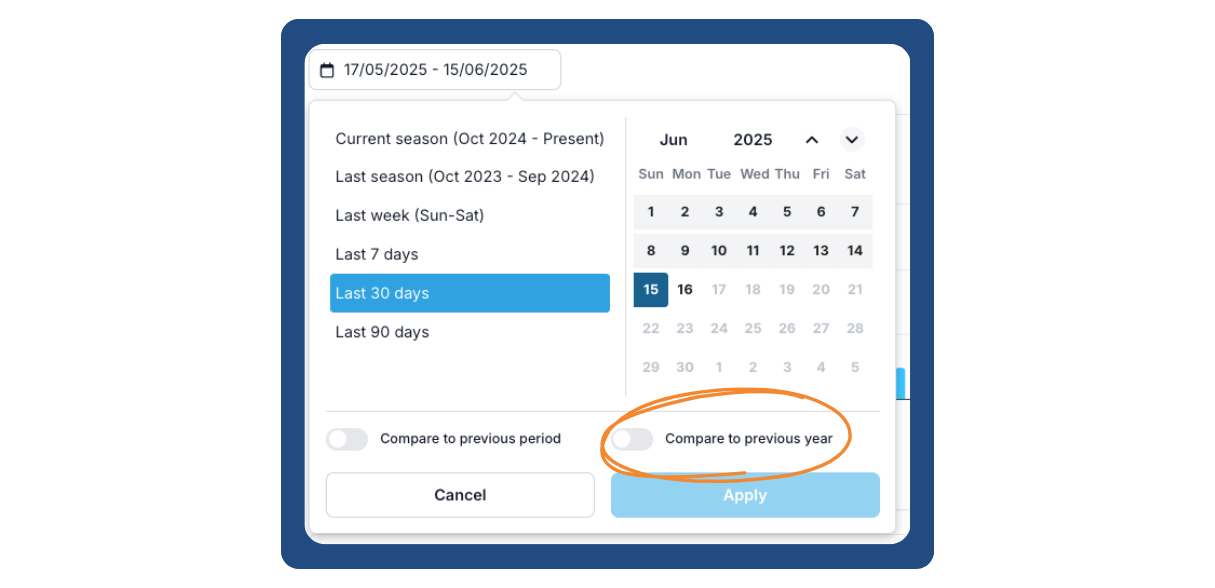
This section also includes a comparison feature, allowing you to view current data alongside the previous letting season—something we’ll explore further in later sections.
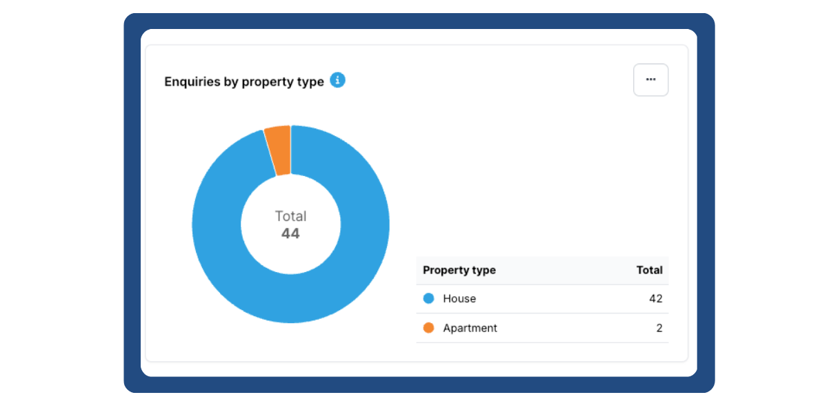
Total Enquiries & Enquiries by Property Type
The dashboard provides a clear visual snapshot of how your enquiries have trended over time. You can customise the chart style by hovering over the three-dot icon—this applies to all charts across the portal. Beneath the main chart, there is a breakdown of enquiries by property type, offering a comparison between categories such as houses and apartments to determine which is generating more interest.
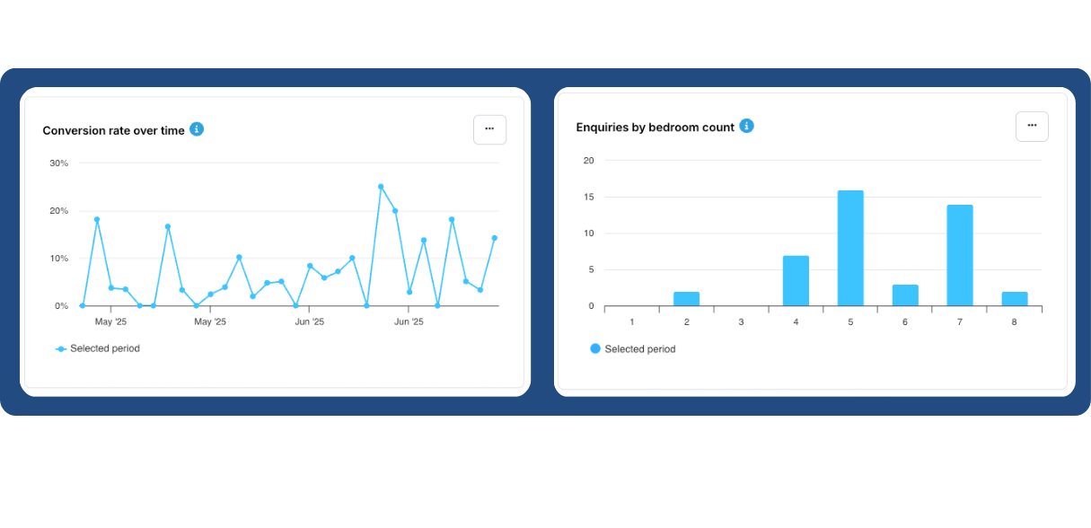
Additional Insights
- Conversion Rate: This metric displays the percentage of property views that convert into enquiries on a daily basis, helping you monitor engagement over time.
- Bedroom Count: This section identifies which bedroom sizes are generating the highest number of enquiries.
Lastly, by scrolling to the top of the page, you can refine your data view by city. From there, you can drill down even further to explore enquiry volume by specific areas.
2. Discovery: Measuring Visibility and Engagement
Next, we move on to the Discovery section. This area provides a top-level view of your listings’ visibility and interaction over time.
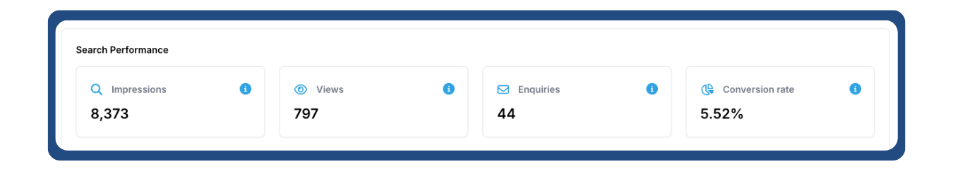
Key Metrics
Here, four core metrics are presented to reflect a prospective tenant’s journey through your listings:
- Impressions: How many times your properties have appeared in search results.
- Views: How many users have clicked to view your property listings.
- Enquiries: The number of enquiries received over the selected timeframe.
- Conversion Rate: The percentage of viewers who submitted an enquiry.
These metrics are displayed from left to right, echoing the typical funnel experienced by student users—from initial visibility to enquiry.
Visual Overview
At the bottom of this section, a graph illustrates how impressions, views, and conversion rates have shifted over time. You’ll also find a daily average breakdown, which is useful for spotting performance trends.As in the Enquiries section, the date range can be adjusted to compare historical and current data, helping you assess campaign effectiveness over multiple seasons.
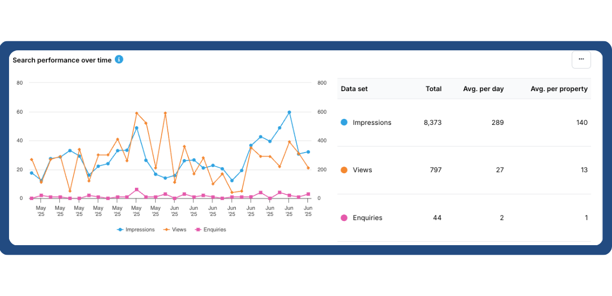
A helpful feature to note: if you ever need clarity on what a metric means, simply hover over the blue "i" icon for a quick explanation.
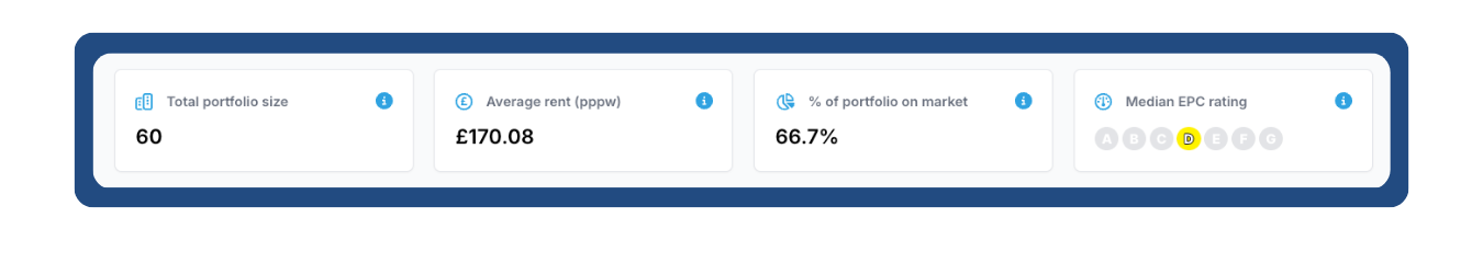
3. Portfolio: Understanding Property Status and Distribution
The Portfolio section provides an up-to-date snapshot of your property holdings and their performance.
Portfolio Summary
At the top of the page, you’ll see an overview of key portfolio metrics:
- Total Portfolio Size
- Average Rent per Week
- Percentage of Portfolio Currently on the Market – For example, the sample account shows only 3% of properties are live, with the rest already let.
- Median EPC Rating, based on the property information you’ve submitted.
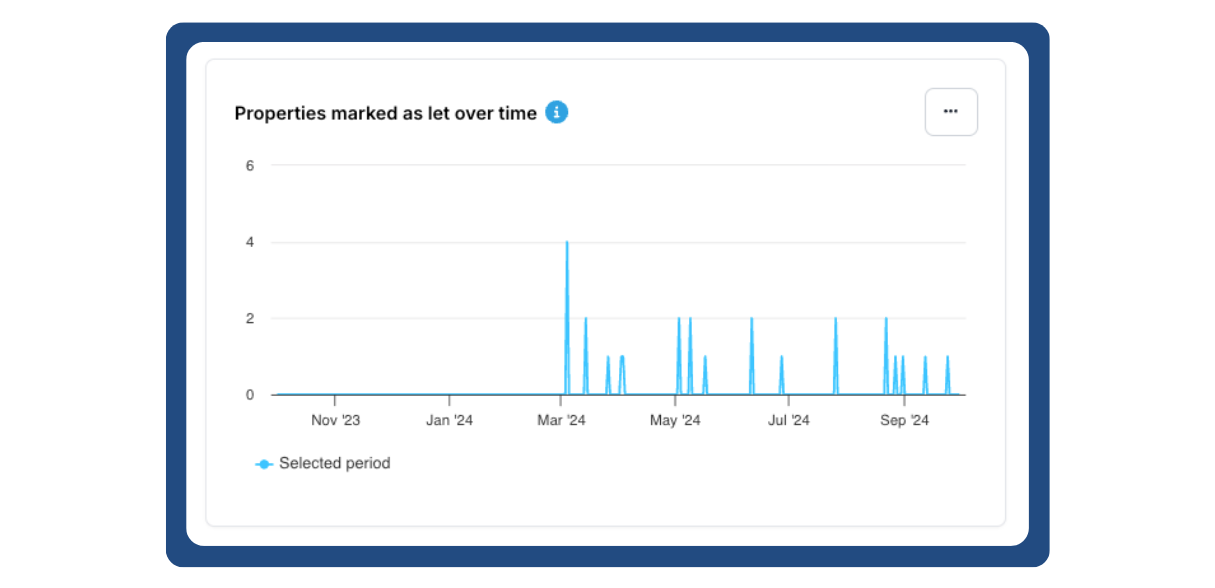
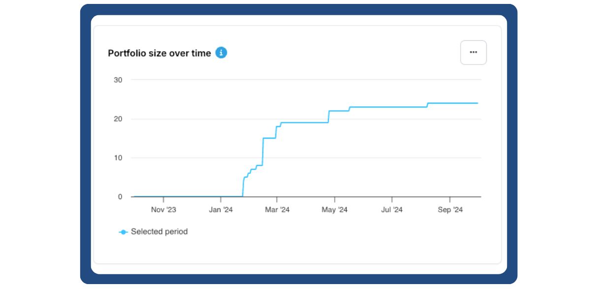
Detailed Portfolio Breakdown
Below the summary, the dashboard displays several breakdowns based on the selected date range:
- Let Properties: This panel shows which properties have been successfully let. It’s advisable to mark properties as ‘let’ as soon as they’re filled to ensure accurate tracking.
- Portfolio Over Time: Found at the top left, this graph shows how your active portfolio size has changed throughout the letting season.
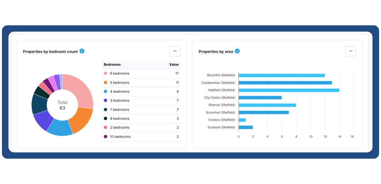
- Properties by Bedroom Count and Area: Two charts show how your properties are distributed—first by number of bedrooms, and then by geographic area. You can adjust the chart style to suit your preference.
The final two panels in this section provide insights into:
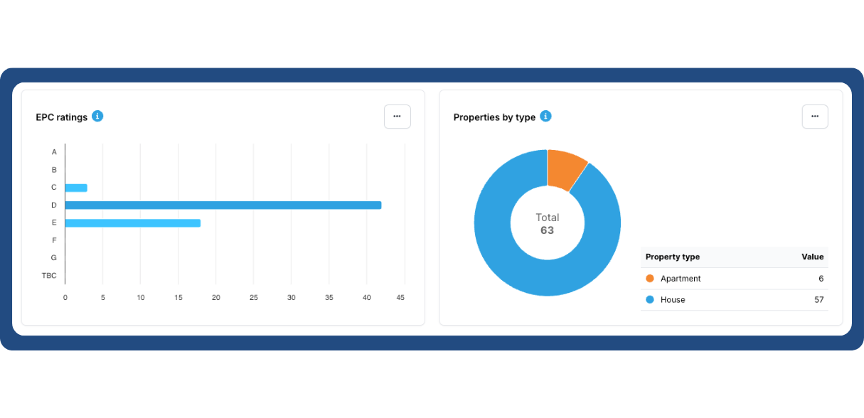
- EPC Ratings Distribution
- Property Type Distribution—giving a clearer picture of your portfolio’s composition.
4. Market: Benchmarking Against the Wider Market
The final section of the dashboard is Market, a valuable tool for comparing your portfolio’s performance with the wider rental landscape in your area.
Live Market Data
This section provides live, real-time data on the average rental prices in your selected city. This is particularly helpful when compared with your own rental data in the Portfolio section, giving you a clear view of whether your listings are priced above, below, or in line with the market average.
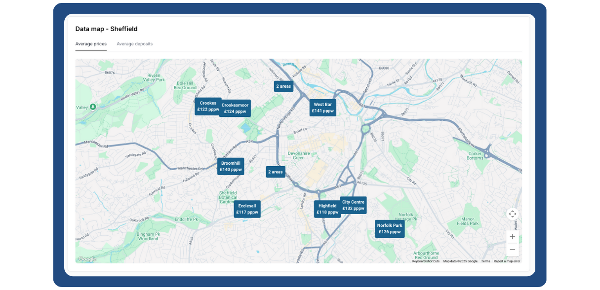
Because this section is constantly updated, it’s especially useful when you have multiple properties currently on the market. It allows you to adjust pricing or marketing strategies accordingly to stay competitive within your local market.
The Portal Analytics Dashboard offers a powerful suite of tools to help you analyse, optimise, and act on your portfolio’s performance data. By understanding the full user journey—from visibility through to enquiries—you can make more informed decisions throughout the letting cycle.
Whether you’re monitoring interest by property type, comparing past and present performance, or benchmarking against the broader market, this dashboard is your central hub for strategic insight.
For more information, please get in contact with your account manager - 0114 352 0082